Problem

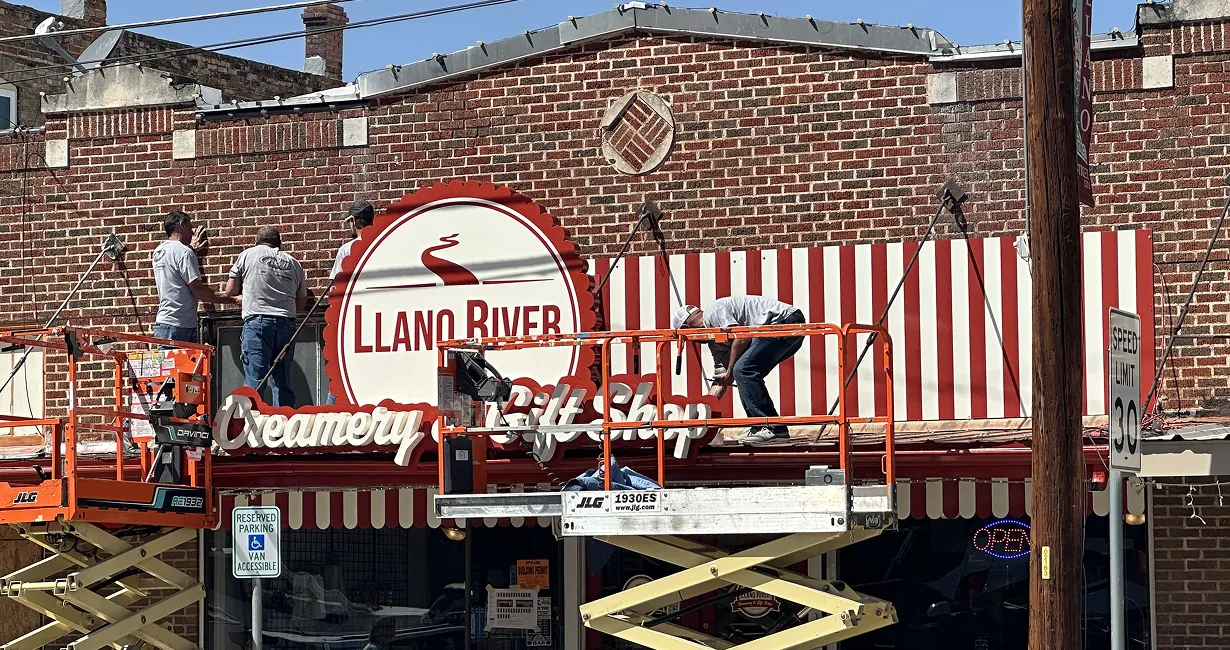
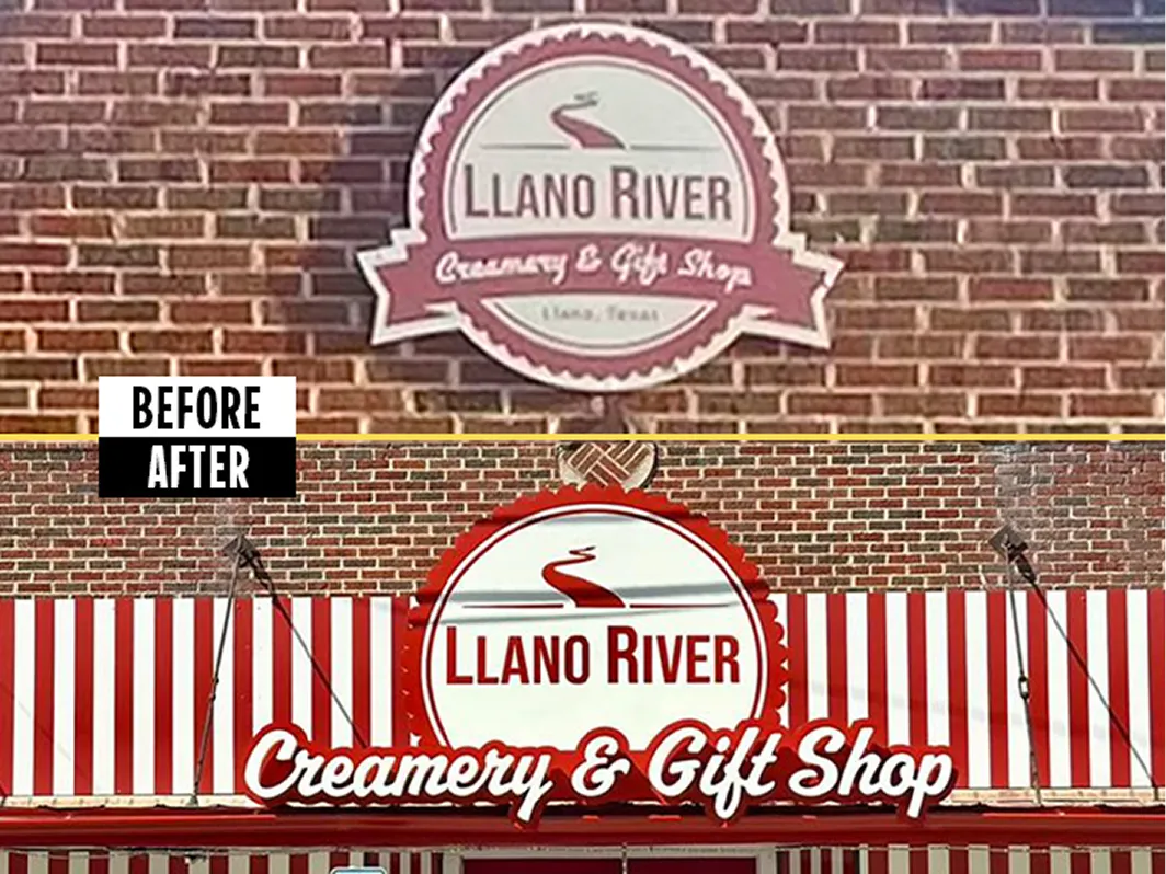
Llano River Creamery & Gift Shop is a small-town creamery located on a highly visible main street in a historic district in Llano, Texas. Despite strong foot traffic and a prime location, the owners felt the storefront did not reflect the quality or character of their brand. The existing facade also had visual constraints, including older architectural elements and window bars that negatively impacted curb appeal, something they wanted to address with new signage.

From a design and fabrication standpoint, the project also had several site-specific requirements and limitations we had to keep in mind. The storefront awning restricted available mounting surfaces, which reduced options for wall-based signage placement. In addition, the project had to comply with historic district code requirements, including restrictions on color use and lighting treatment. We collaborated with a design partner to develop the concept, then it was time to bring the design to life in the shop.

The Solution

We developed a storefront signage solution engineered around both the building’s physical constraints and the historic district requirements to provide an eye-catching transformation. The design strategy focused on creating a bold visual identity that addressed the owners’ main priorities.

The final signage package incorporated a prominent branded sign element designed for visibility along the town’s Main Street and positioned to work seamlessly with the awning geometry rather than compete with it.

We also used graphics strategically to address problem areas on the facade, including graphic solutions that helped address less attractive building features, such as the older windows, helping to unify the storefront presentation.

Material and finish selections were made to support long-term exterior durability while maintaining a handcrafted, small-town aesthetic aligned with the creamery’s brand.

Final Impact

The finished storefront significantly improved roadside visibility and strengthened Llano River Creamery’s presence on the main street. The updated signage now communicates a clear brand identity to both local customers and visitors entering town.

Just as importantly, the solution resolved visual inconsistencies on the older building facade and turned architectural limitations into a cohesive design feature. The storefront now reads as intentional, polished, and on-brand while still fitting the character of the historic district.

Start Your New Signage Project Today

Let’s elevate spaces together.