At NAI Signs, we don’t see accessibility and design as opposites. They move together, like light and shadow. Our ADA-compliant signage meets code, fits architecture, and most importantly, respects how people actually move through hotels, hospitals, campuses, and public spaces where clarity can feel like kindness.
What ADA-Compliant Signage Really Means
Rules exist, sure. But the spirit of ADA signage is simple: help everyone find their way without needing to ask. That’s it.
So, we build with these basics in our bones:
- Tactile lettering and braille for those who read by touch.
- High contrast so words don’t melt into the wall.
- Non-glare finishes so bright light never blinds the message.
- Consistent mounting so your brain starts trusting the pattern.
- Room IDs, exits, corridors, every piece follows the same quiet rhythm.
The NAI Way: Accessible Design with Style
Compliance is where we start, not where we stop.
Fit The Architecture
Each sign is designed like it was born there. Materials, corners, colors, all tuned to the building’s heartbeat.
Choose Materials with Intent.
Metals that age gracefully, colors that still speak under fluorescent light, textures that feel right under a hand.
Deliver Consistency at Scale
Whether it’s one building or ten buildings, every sign should feel like it came from the same family. Whether you manage a hotel chain, a clinic, or a corporate campus, accessibility shouldn’t look generic. It should look like you.
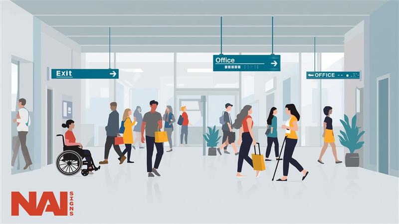
The Types That Tell the Story
- Room IDs: doors, offices, restrooms, and places we enter.
- Wayfinding: corridors, garages, sprawling campuses where arrows matter.
- Exit and safety, the signs you hope no one ever needs, but everyone should see.
- Custom-branded ADA-compliant signage, your logo, and palette, still within the rules.
Each one speaks a little differently but sings the same tune.
From Code to Craft
Designing ADA-compliant signage isn’t paperwork. It’s craft with a conscience. Here’s how we keep it both human and precise:
Discovery And Code Review
We listen, walk the space, and find where confusion hides.
Design And Mockups
Clarity meets character. Typefaces with personality but discipline, contrast that pops but doesn’t shout.
Fabrication and QA
Every raised letter cut clean, every braille dot placed where fingertips expect it.
Installation And Verification
Mounted exactly, measured again, logged down to the inch.
Mistakes We Keep from Happening
- Contrast that looked fine in Illustrator but vanishes under daylight.
- Mounting that drifts half an inch between floors and breaks the pattern.
- Fancy fonts that can’t be read by touch, or anyone in a hurry.
- Multi-site programs where each branch “interprets” the rules differently.
We prevent all of that. Tight specs, trained hands, field-tested prototypes. Because do-overs cost more than doing it right.

Why It Matters
People remember how a space feels. Calm corridors, effortless directions, signs that don’t compete for attention but quietly help, it all adds up. Good wayfinding removes friction. And friction, in business or healing or hospitality, is the enemy of trust.
The Real Value of Compliance
Yes, ADA-compliant signage avoids fines and rework. But it also says something bigger: We thought about you. It signals care, safety, and inclusion before a word is read. That’s good ethics, and good business.
Accessibility Should Never Mean Ordinary
Accessible doesn’t mean a lack of design. With the right mix of materials, typography, and contrast, ADA signage looks modern, even elegant. The kind that disappears until someone truly needs it.
At NAI Signs, we bring together craft and code, function and feeling. From braille room IDs to campus-wide wayfinding, each sign is a small act of consideration made visible.
A Quick Reality Checklist
- Map every sign type your space needs.
- Lock in type specs, tactile details, and contrast targets.
- Approve samples under real lighting, not studio light.
- Fix placement and mounting rules before fabrication.
- Prototype. Walk the route. Adjust if it feels off.
Document everything so updates stay aligned. That’s how you build something that lasts and works.
Conclusion: When Design Listens, Spaces Speak
It’s easy to follow a rulebook. Harder to follow a feeling. ADA-compliant signage was never about regulations on a page; it’s about that silent understanding between a person and the space they’re in. The moment when the sign disappears, and instinct takes over. You brush your hand across raised text that feels deliberate. The hallway curves just right. The light catches the letters, soft but sure. Nothing calls for your attention, yet everything works together to say, you belong here. That’s the language we speak at NAI Signs. The unspoken kind. We build signage that meets standards, yes, but more than that, signage that makes spaces thoughtful. Because when design starts to listen, people stop thinking about where they are supposed to go. They just go. And that’s when space stops being a structure and starts becoming an experience.
Partner with NAI Signs
Are you ready to shape spaces that guide everyone, gracefully? Partner with NAI Signs. We’ll help you design ADA-compliant signage that reflects your brand and makes every visitor feel they belong.