People shouldn’t need help getting around inside a building. Whether they are in a hospital, on the university grounds or in a shop or business office, visitors expect to be put on the right path as soon as they walk in. Difficulties with getting around have a way of ruffling people’s feathers and putting workers on edge; it also does nothing for the company’s standing in the eyes of the public. That is where smart wayfinding signage comes into its own. It is all too easy for an experience to be marred by confusion, but the right signage will put things right and make for a more pleasant visit, while at the same time being in keeping with your firm’s image.
Good navigation isn’t about putting up more signs; it’s about coming up with a well-thought-out system that actually works.
Why Effective Wayfinding Signage Transforms Visitor Experience
There is more to ease of movement than mere comfort. Wayfinding signage has a role to play in all sorts of settings. In a hospital, for example, it can put the mind at ease for those receiving treatment as well as their visitors. A shopping center will use it to point customers in the direction of a sale or a particular store. For an office environment it underpins a professional and efficient manner of working, while on school grounds it is what lets students and others navigate the expanse with little trouble.
Yet too often the systems in place are not well thought out, which creates its own set of problems. One sees workers having to put down what they are doing to give directions, or a customer left to wander. It means some may miss a service or section entirely and the overall brand experience is wanting. A properly designed system puts an end to that at the source.
The Core Elements of an Effective System
A good plan for helping people get around usually has a number of parts that go together.
- Directory Displays That Set the Foundation
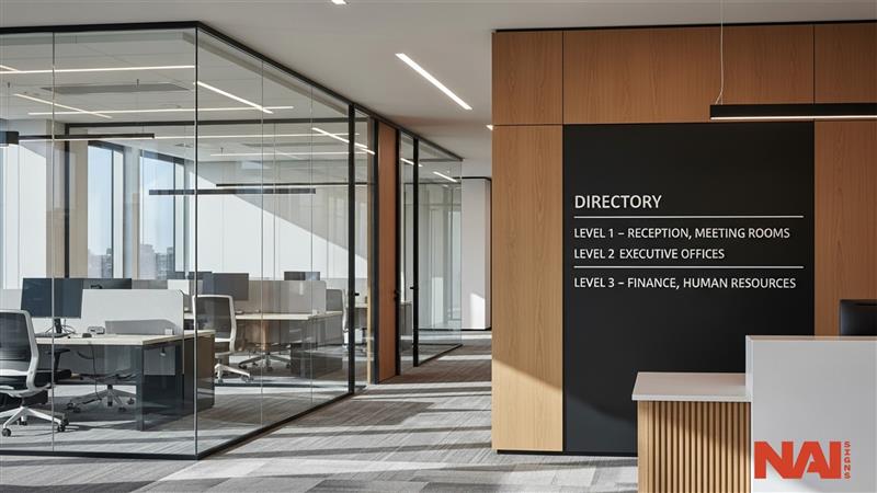
Directory signs give a general view of the area. They answer the most basic question: “Where am I, and where do I have to go?”
Good directories are put at main choice points, like doors, waiting rooms, and where the elevators are. They use plain writing styles, sensible arrangements, and materials with a lot of contrast in color to make sure they can be read.
In buildings with many renters or where people get medical care, directory signs must also be able to change as needed. Sections change. Renters move. Designing with flexibility prevents expensive replacements later.
- Guiding Movement with Clear Wayfinding Signage
Wayfinding signage shows people the way. Where they are put is very important. Signs must appear before a choice point, not after. Arrows must be plain. The language must be the same in all places where people come into contact.
In big places or school grounds, directional signs for events become especially important. Meetings, ceremonies, and yearly events bring in short-term traffic patterns. Short-term signs should fit in with the look of the lasting systems to keep the company’s image the same.
- Reinforcing Confidence with Confirmation Markers
Signs that make sure to show visitors they’ve reached the right place. Room numbers, labels for sets of rooms, section names, and signs for toilets lower worry and stop people from going back on themselves.
Without these signs, even the best direction system isn’t good enough.
How Different Industries Approach Wayfinding Signage Design
Different places require different plans.
- Healthcare Environments Require Precision and Compliance
Hospitals and medical centers are naturally complicated. People getting care might already be stressed or worried. Clear systems for getting around lower emotional strain and make the general experience better.
Following the Americans with Disabilities Act is essential. Correct heights for mounting, letters people can feel, and Braille must be put in from the beginning. Mistakes with these rules can lead to expensive fixes.
- Retail Spaces That Guide and Influence Customer Flow
Navigation in retail supports both clarity and income. Using wayfinding signage well can get people moving to the parts of a store that make the most money, or to special displays.
Things stores often use to help people find their way are hanging signs over aisles, markers for each department, maps at the entrance, and subtle graphics on the floor. If these things are planned well, people will spend more time in the store and look around at more things.
- Corporate Offices That Reflect Professionalism
In professional offices, people should be able to find their way, from the front desk to the meeting room, without needing to ask.
Simple lists of where things are made with good materials show how classy the company is. Careful making and installing is especially important in offices, because people will really notice how well the signs fit with everything else.
- Educational Campuses That Simplify Complex Layouts
Schools and colleges often get bigger and bigger, so their layouts get complicated. Using color to mark off areas, lists of places that can be made bigger or smaller as needed, and always using the same names for places, makes it easier to get around all the buildings.
When there are events on campus, short-term signs pointing the way make sure crowds move easily, and don’t spoil the usual look of the place.
Design Principles That Make Things Clear
Good systems depend on basic design principles.
- Consistency
The writing style, colors, symbols, and words used must be the same everywhere in the area. If they aren’t, it causes people to be confused.
- Visual Order
The main places people want to go to should be very clear, while other details support that. Putting too much on one sign makes it less useful.
- Easily Readable
What materials are chosen, how much difference in color there is, the lighting, and how high the signs are put up all effect how easily they can be read. Good quality making makes sure the letters stay sharp and last a long time.
- Where Signs Are Put
Signs should be exactly where people have to make a choice about which way to go. Putting signs in the wrong place is one of the most frequent faults in directional systems.
What Happens When Signs Are Not Thought About Until the Last Minute
Many organizations only consider signage late in the design process. This leads to discrepancies between the architects’ intentions and the final outcome.
Common problems are:
- A haphazard, unrefined approach
- Inconsistent terminology
- Exterior signs at odds with the interior
- Errors on the part of outside contractors
To have a system that functions as it should, there has to be a plan in place from the outset and all the way through to installation. When teams within the company are involved they can ensure the finish is protected and oversee the straightness and manner of the work. In the end, the quality of the system is only as good as the care taken in putting it up.
The Long-Term Benefits of a Well-Planned System
Spending money on a good system lower running costs over time. Staff spend less time giving directions. Visitors can find their way around on their own. The image of the brand becomes stronger across all areas and places. Good materials also last longer. Poor quality making may lower the first cost, but often leads to colors fading, surfaces peeling, or things falling apart. Direction is not only practical. It is part of the experience of the brand.
Final Thoughts
Helping people move confidently through an area needs more than wayfinding signage. It needs careful planning, a design that all goes together, good quality making, and accurate fitting. From directory signs to signs pointing the way, and temporary event solutions, everything must work with everything else. When done correctly, people may not even notice the system. They just experience clarity. That is the aim.